The mobile version of Cult Of Mac. The banner and ad follow the user.
This has been a growing annoyance. I've noticed that mobile sites often aren't just reformatted websites that make are easier to navigate on a small screen, but they're also incredibly crippled. For example, Cult Of Mac is one of my favorite sources of Mac news. However, the mobile site is an atrocity. The title bar follows you whole navigating, blocking the article and comment section. Plus, they've recently added an ad section that also follows your view. They've cut down on the usable space, and that's exactly what you shouldn't have on a mobile device. They already get money from a page view on the ad, why does it need to follow the user? As for the title bar, why does it need to follow you, when tapping the bar at the top of an iOS device brings you to the top of a page? Worst of all, you can't actually turn off the mobile version, even if you select the full site.
It doesn't stop with Cult Of Mac, many mobile sites have dumbed down interfaces that are overly simplistic. Gawker sites don't allow users to log in or comment when they're using a mobile device, and not all the comments are visible. Their desktop interface is horrible on computers, and especially bad on a mobile device.
Not all websites do this wrong though. Engadget, for example, allows user to read stories and comment, just as they could when browsing from a computer. Yet they've still designed an interface that works for a smaller screen. The blogger service, which I use here, allows users to view stories and comment. I actually like using it on my iPhone, which is more than I can say about most mobile pages.
With the growing popularity of smartphones and tablets, perhaps website owners will wake up and put a bit more effort into the design of their mobile sites. Right now, most of them are, without a doubt, terrible. Hopefully, this changes soon.
Google really transformed how we think about search system and now Google has truly transformed how we think about Super Bowl adverts. Without any famous celebrities, unusual effects or other jokes, Google did what Google does best. It showed to all world how Google had changed the world. The advert is unlikely to win any creativity awards but unlike usual adverts I think it made a real powerful impact in the mind on consumers.
Budweiser
In general, I was underwhelmed with Anheuser-Busch’s advert this year. Frequently Budweiser dominates the game and very easily delivers among the really best in the bowl. While Budweiser did not have its best year, but absolutely average for Budweiser is still real good. They formally own the Super Bowl and Budweiser are still the great King of Beers. As usual, the very best advert used the Clydesdales, the iconic symbol of the Trade Mark. But the ad itself was not as nice as the Clydesdale adverts of past years. If they would stop line-extended Bud Light, then maybe they would have considerably more time to work on the adverts.
Doritos
Who really needs a fancy award-winning agency when you can hold a contest and get your unique adverts for free? For a cool, spicy, fun, youth-oriented TM the great strategy paid off truly big time. The charming dog with the bark collar was hilarious and had a real TM payoff at the end.
Snickers
When you brand owns a magnificent, clear and excellent idea in the mind, it is a whole lot easier to make a famous commercial adv. Snickers, the №1 candy bar, is focused on adults (or positioning as adults). Having a unusual Betty White turn into a young man playing football was not only visually impressionable, but also packed a mean branding adv punch too.
Denny’s
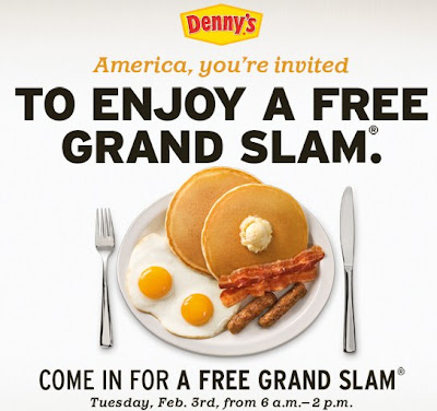
The free-breakfast idea got average people truly excited last year. So Denny’s repeated the usual giveaway. And people most likely got even really excited about the free breakfast this year. But on high top of breakfast Denny’s delivered some of the especially top adverts of the game. Again when you have a non-standard idea, it is a lot easier to get great creative work. “It’s a good time to be an American, but a really bad time to be a chicken.” Who can forget this slogan?
Want the same success? Full Service Design Agency in New York and Florida specialises on competent and effective advertising of your projects.