Colour palette
The black text on a white background or the light text on a black background are passive colours. Vigorous colours can help to direct attention to some concrete elements of a site to which you would like to pay attention of the potential visitor.
The balanced hierarchy
The balance of web design has great value as the balance allocates potential to the user with feeling of stability and clearness. The balanced web design is easier for acquiring and understanding, as the web site is created by means of visual hierarchy, that, undoubtedly, shows, that is more important on a web site and that is less important.
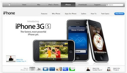
Why design Apple is effective? According to Webdesign.org, the design of site Apple is similar to a theatrical scene where visitors are visitors of theatre, and a product are actors who entertain visitors.
Intuitive navigation
The web developer has a main task is a convenience of your visitors, satisfaction of their requirements, and to give them enough possibilities for high-grade and intuitively clear navigation. Bay Area Web Development Company does not advise flash-navigation, because this standard has problems of display on some web browsers. It is recommended to use: HTML, CSS or Java-navigations.
{ 0 komentar... read them below or add one }
Posting Komentar